We’ve been working with the team at Deanston for over two years to help them strengthen their brand and design.
Our creative approach is strongly focused on the community and the people behind the brand - this is what really sets Deanston apart from the competition.
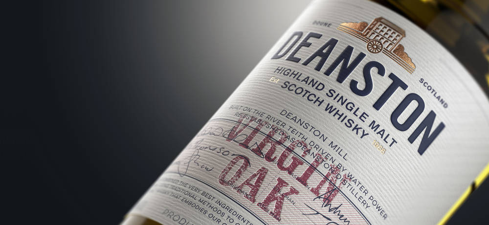
So many brands try to focus on heritage, community and craft these days - but very few can genuinely claim it. For Deanston, however, it all comes naturally. The former mill that now houses the distillery is at the heart of the community, and the product itself is hand-crafted using local ingredients. The distillery even generates its own power - and is the only distillery in Scotland to do so.
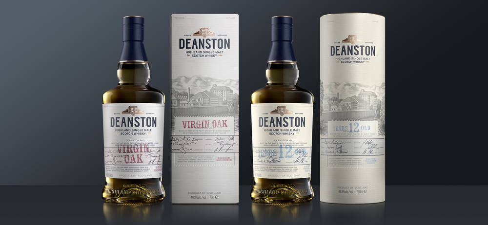
The first two products to launch with the new design are Deanston 12 year old and Deanston Virgin Oak. The labels centre on this spirit of place and history, and features a redrawn icon of the former mill that houses the distillery. The labels also include signatures of the staff at the distillery itself – from the distillery manager to stillmen and warehousemen - Deanston really is something they are happy to put their names to.
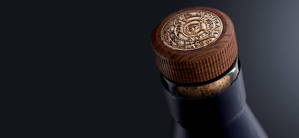
On top of the bottle sits a capsule closure which features an embossed replica coin – representing the currency used by employees of the cotton mill in the 18th century.
The outer packaging continues this attention to detail. The Deanston Virgin Oak is in a carton, while the Deanston 12 Year Old is in a tube – and both feature a newly commissioned woodcut of the distillery.
Deanston is a product where care and attention to detail are paramount - something we wanted to reflect in the packaging.
I think we can all drink to that.